In today’s post, we’re diving into two fundamental types of charts used in market analysis: OHLC Charts and Candlestick Charts. Both are crucial for understanding market trends and making informed trading decisions, but they have distinct features and applications. Let’s unravel these charting tools to see how they can enhance your trading strategy.
What are OHLC Charts?
OHLC charts, standing for Open, High, Low, and Close, are a staple in financial analysis. They provide a clear and concise representation of a security’s price movements within a specific time frame. Each ‘bar’ in an OHLC chart represents four key pieces of information:
- Open: The opening price of the period.
- High: The highest price during the period.
- Low: The lowest price during the period.
- Close: The closing price of the period.
The vertical line shows the range between the high and low prices, while horizontal lines on either side indicate the opening and closing prices. These charts are straightforward yet informative, offering a quick snapshot of market sentiment and price volatility.
What are Candlestick Charts?
Candlestick charts, originating from Japan, provide the same four data points as OHLC charts but in a more visual manner. Each ‘candlestick’ consists of a ‘body‘ and ‘wicks.’ The body shows the open and close, and the wicks represent the high and low. The color of the body (often red for a price decrease and green for an increase) offers an immediate visual cue about market direction.
Candlestick charts are highly valued for their ability to depict market trends and patterns. They’re not just about numbers; they tell a story about trader sentiment, market emotion, and potential future movements.
Comparing OHLC and Candlestick Charts
At first glance, OHLC and Candlestick charts might seem similar since they provide the same data. However, the way this data is presented makes all the difference:
- Visualization: Candlestick charts are more visually intuitive. The colored bodies make it easier to see price movements at a glance.
- Pattern Recognition: Candlestick charts are preferred for identifying trading patterns and signals due to their distinct visual style.
- User Preference: Some traders prefer the simplicity and minimalism of OHLC charts, while others opt for the detailed narrative of candlestick charts.
Advantages and Disadvantages
OHLC Charts
- Advantages: Simple, direct, and less cluttered. Ideal for traders who prefer a straightforward approach.
- Disadvantages: Less effective for recognizing complex market patterns and trends.
Candlestick Charts
- Advantages: Detailed visual representation, excellent for pattern recognition and predicting future trends.
- Disadvantages: Can be visually overwhelming for beginners. Requires some learning to interpret effectively.
Practical Applications
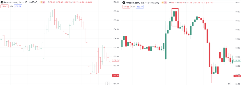
Let’s take an example: analyzing the stock of Amazon (AMZN). Using an OHLC chart, you can quickly gauge the volatility and general price movement. Switching to a candlestick chart, you might spot a ‘Bearish Engulfing’ pattern, suggesting a potential downturn, something that might not be as apparent with an OHLC chart.
OHLC and Candlestick charts are like two dialects of the same language of financial analysis. Each has its strengths and suits different aspects of market analysis. Whether you prefer the clarity of OHLC or the depth of candlesticks, understanding both is essential for a well-rounded approach to market interpretation.
Disclaimer: these articles are for educational purposes only. Market analysis, prices, news, trade ideas, or any other information within this site or the chatroom is not investment advice.[/vc_column_text]